interior design

Zinnia Color Pallete

Miss me yet? I've been taking a break from painting...by painting walls, hanging shelves, and in general being a DIY star. I have to say that a painted wall is so much more satisfying than a temporarily clean floor.

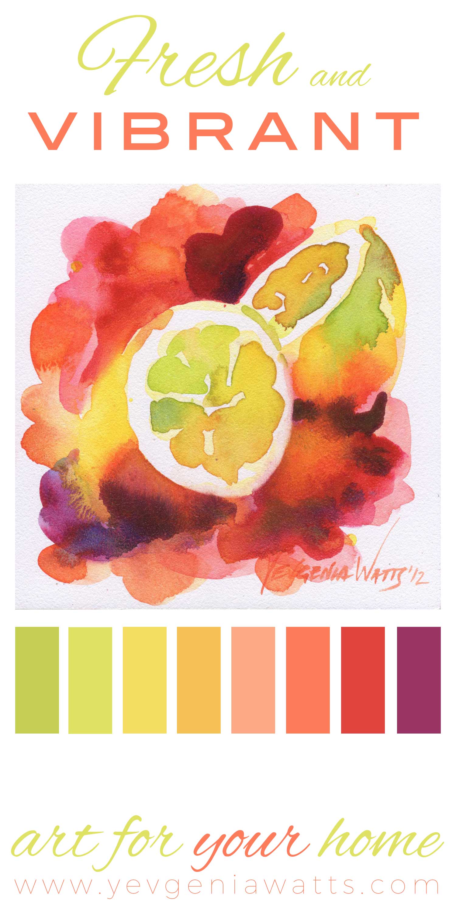
(This is sort of the color of my kitchen walls now. It's a bit less saturated and peachy, more of a cool terra cotta, which Katia insists on calling "pink")

I'm also taking the time between the challenges and shows to work on an ongoing book illustration project and...well, to hang out with my kids :)

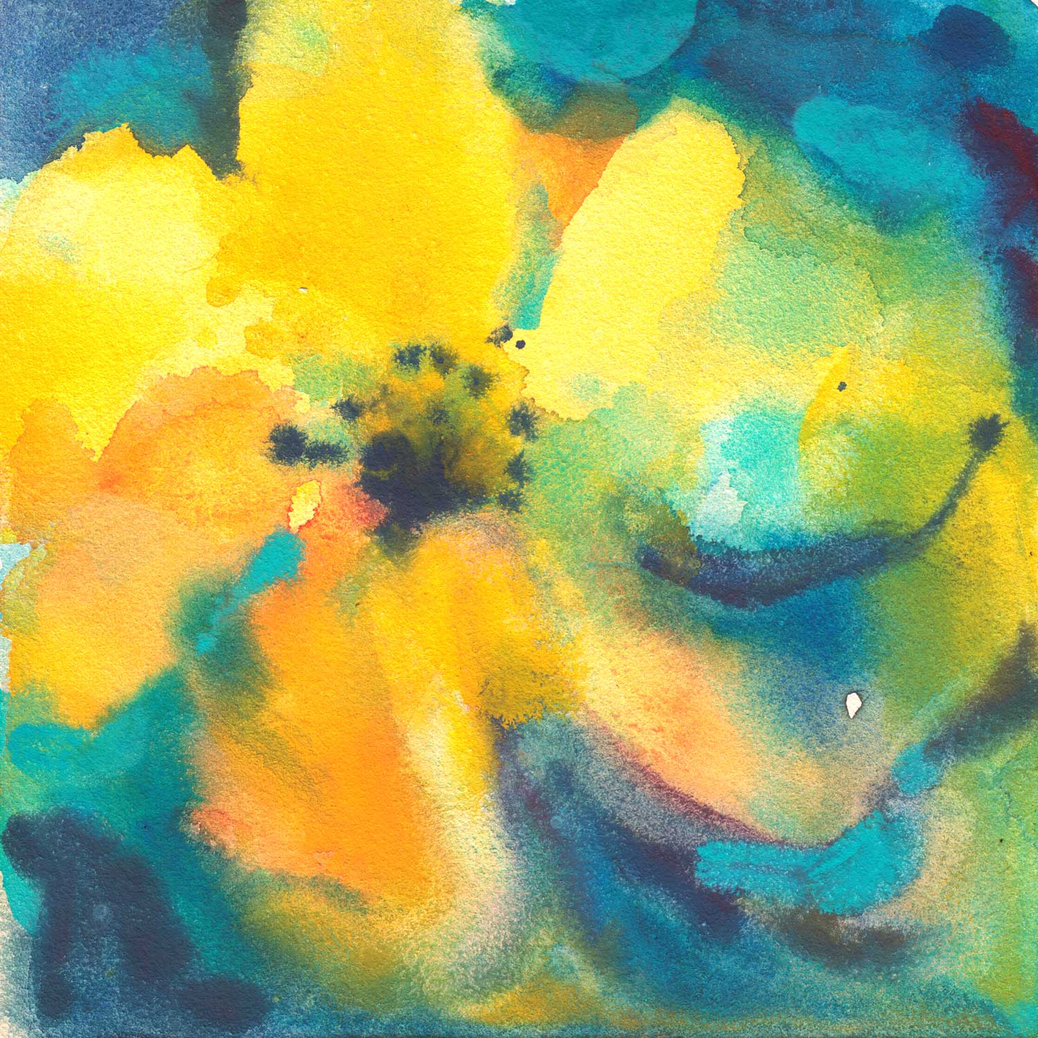
On the wave of my renewed interest in interior design and decorating, I am happy to share with you the next image in the series of color palettes based on my paintings:

A striking floral built around reds and pinks with an exciting accent of light blue and chocolate brown! How about that?

(The original painting above can be found here, and a print of it here)

Summer. Part 4 of 4

Note: I will be publishing a new blog post every weekday for the month of September. If you receive my posts via email and do not want to get them every day, update your subscription preferences to a once-a-week digest (link on the bottom).

This painting is small but it packs a lot of punch. I fully intend to offer it as a print very soon. Look at this mockup of it on the wall:

What do you think?

The original painting almost fits in the palm of my hand:

And it concludes the "Summer," a four panel mini-series that I think looks pretty good together:

You can view the individual paintings here.

The weekend starts tomorrow and I decided to take a break from businessing and enjoy my family. I will still paint, most likely, but you won't see a new post until Monday. I was reminded today of one of my priorities in life - and that is to have as little stress as possible. Which, ideally, directly translates into work-life balance.

Have a great Labor Day weekend! See you on Monday with some yummy Yupo sunflowers ;)

Zingy, Zesty, Tasty Color

This little painting now lives in the home of my friends and collectors, somewhere in Italy. It's almost like a piece of me fulfilling the dreams of worldwide travel. It's a curious feeling.

This image of a lemon cut in half is also one of my best-selling prints, and I imagine it is so because it makes such a fresh and colorful statement piece for a kitchen or dining room. It is definitely not shy. It is bursting with juicy colors that, well, go well together!

I had such a great response to my Coastal Living color palette post, that I decided to make it into a series and continue making inspirational color palettes based on my paintings. I hope you will find these helpful for your interior design and home decorating projects.

If you feel that your kitchen or dining room needs some citrusy, lemony, mouth-wateringly zesty pick-me-up, go here to buy one of these prints!

Will this painting go with my color scheme?

Yes, yes it will.

In the last post, I mentioned doing a lot of work on my art business. I won't bore you with details but I finally realized how much sense it makes for me to work with interior designers and decorators. I am an architectural designer. My art makes people feel happy in their homes (as opposed to provocative or politically charged art). My pillows are selling like hotcakes. I've also had success with other home decor products, like shower curtains and rugs. It just makes sense.

So, with this in mind, I decided to create a series of color schemes based on my paintings. I'm partial to coastal/beach cottage styles, hence my choice of the painting! :)

P.S. Have you seen the amaaaazing interiors in Grace and Frankie? That beach house is a dream!